I love when a project comes together to create a beautiful, comfortable, relaxing home. In the case of this 1932 Spanish style home in Santa Barbara, it was myself, Projects, and Grace Design Associates along with talented painters and subcontractors that reimagined this house into a more modern version of itself, all while still retaining it’s old world charm.
If you read my post last week, I covered the entry hall, living room, dining room, and kitchen. We’ll continue the tour with the master bedroom. The Projects team took what was a closed in stucco balcony, enlarged it, and opened it up with a new railing. And with a view of the ocean, harbor, and city you can understand why!
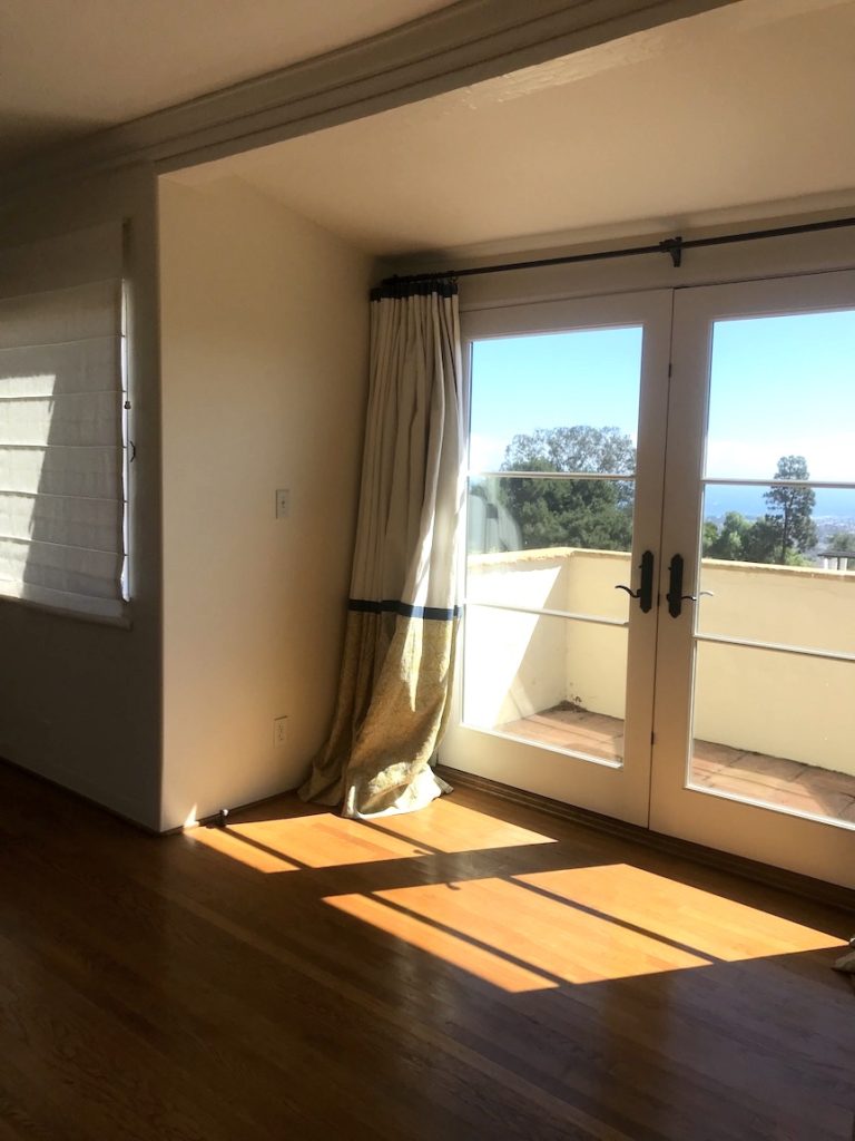

I will admit, the master bedroom isn’t completely finished. I’m keeping my eyes open for a dresser (preferably vintage), lamps, and, some art. But when you have a view like the one above, you want to take your time finding the just the right pieces.
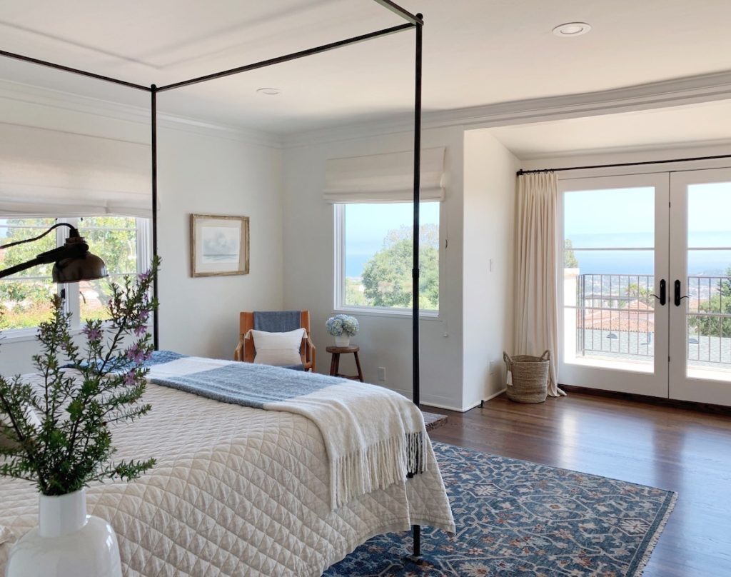
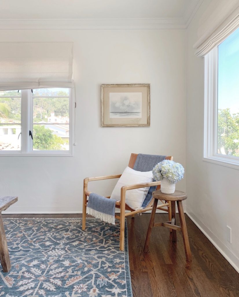
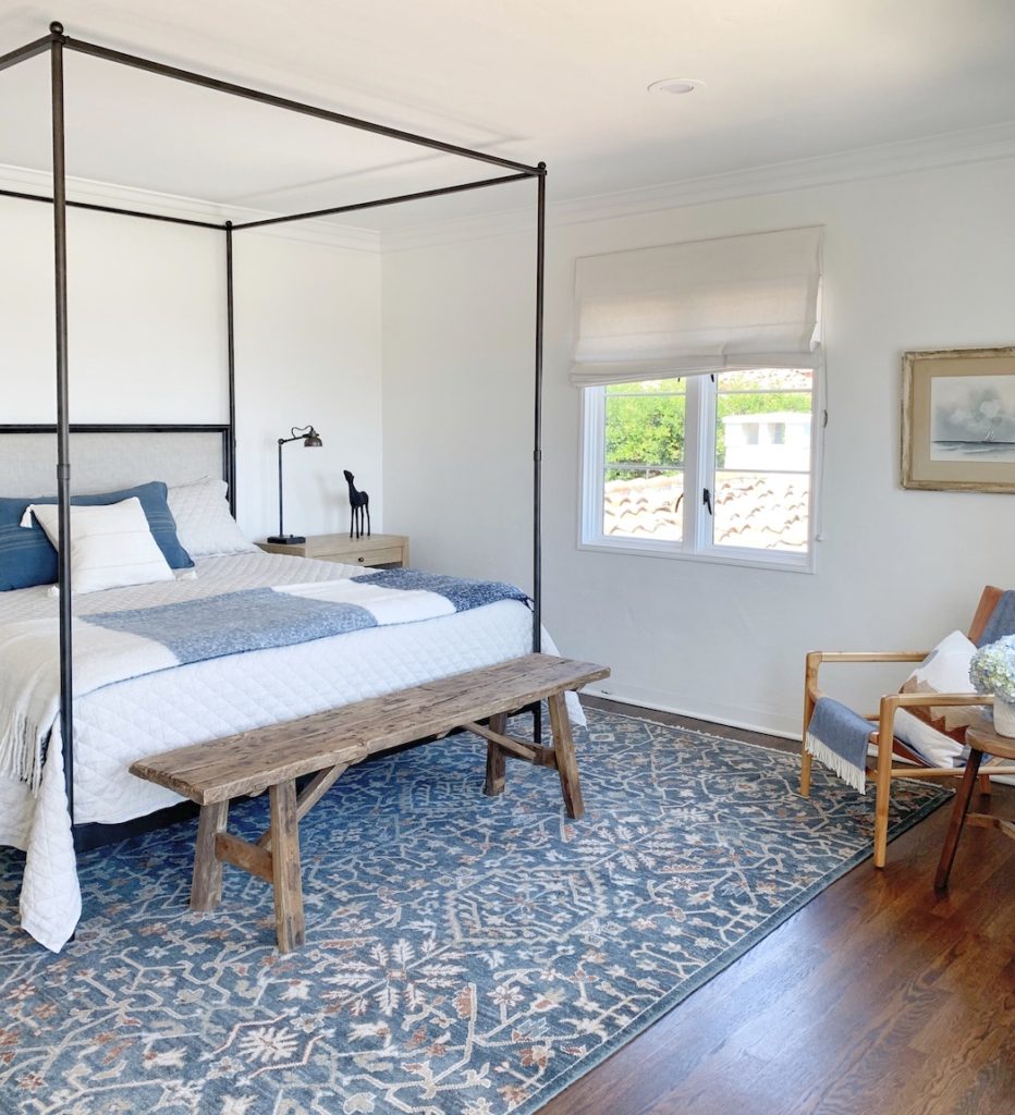
The elegant iron four canopy bed is from RH. I love its clean lines and linen headboard. Just because you don’t have tall ceilings doesn’t mean you can’t have a canopy bed! The bedding is from Pottery Barn. The chair is from the soon to be out of business Wisteria, and the linen pillow is from INDIEbungalow.
I have to say, my favorite part of the bedroom is the rug! I’m normally a neutral rug kind of a gal, but when I learned how much my client loved blue I knew I wanted to incorporate it into the bedroom in a big way. While visiting the East Coast last year, I stopped into the Westport, CT Serena & Lily and spotted the Moraga hand knotted rug. I knew it would be perfect! I always love to give my clients options so I chose two others then sent her an e-mail with links. Unfortunately, the pictures on the S&L website simply don’t do the rug justice. The blues and terra cotta tones are actually gorgeous! My client chose a different (mainly blue) rug from Serena & Lily. It was lovely, but I knew this was the one!
Fast forward a few weeks and my client calls to tell me she saw the rug in person at the Serena & Lily in Boston. Would it be possible to switch since it hadn’t shipped out yet? The S & L gals were terrific and the exchange was made. Happy client and happy stylist!
This home has three levels. The extra weight of the new larger terrace off the master necessitated a restructuring at the bottom of the house to support it. To be honest, the downstairs level was not my favorite part of the house as it was a bit dark (which is actually perfect for television viewing!). However, it did have a bright and wonderful glassed in sunporch off it with doors to a terrace and the gardens. It also had a small bathroom with a shower making it perfect for guests.
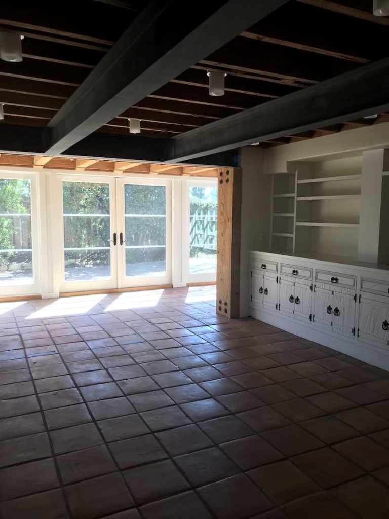
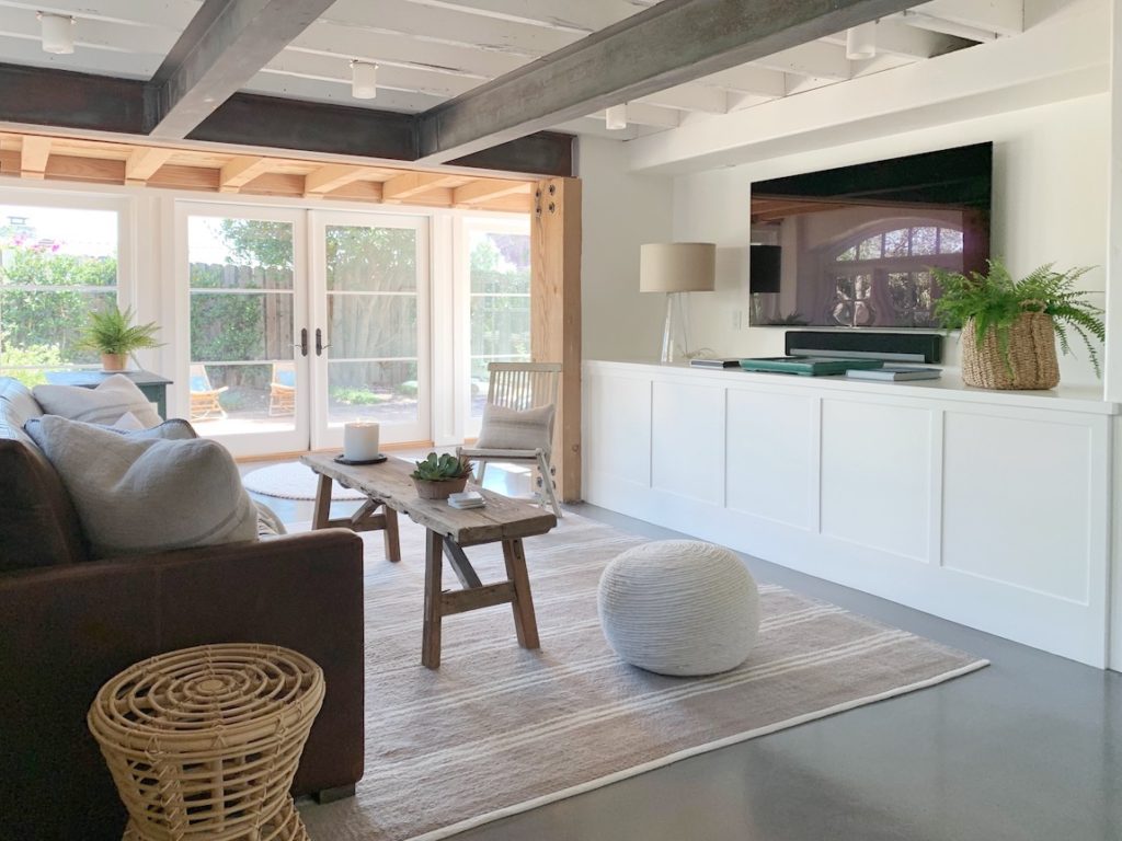
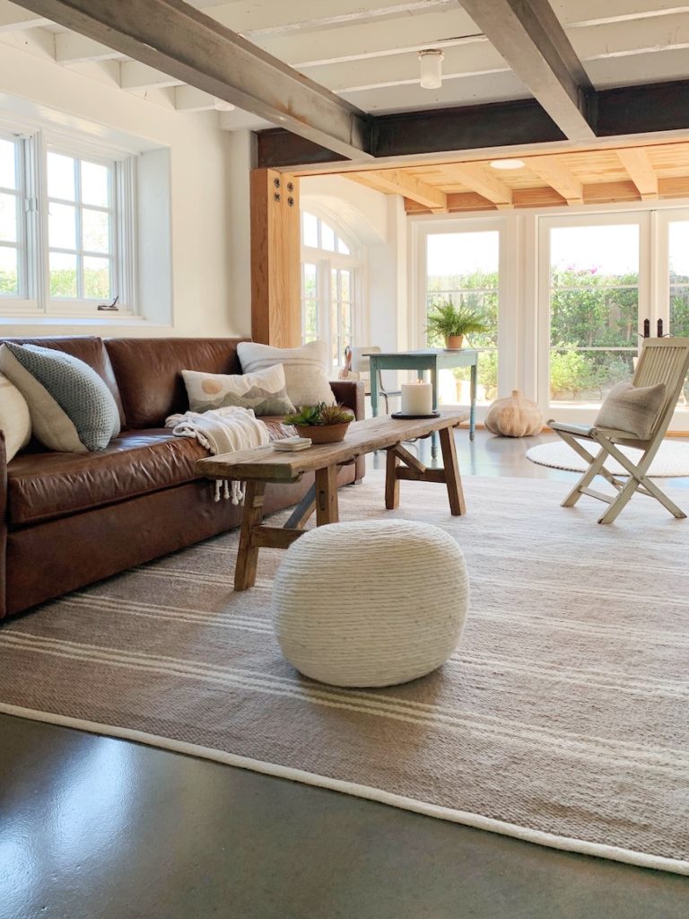
Because this space will be used as a guest room as well as a media room, I chose an 8′ leather sleeper sofa from RH. This one opens up to a king size mattress! These are not the pull outs of old with a lumpy mattress and metal bar that hits you in the middle of the back. This comes with a gel mattress an, having slept on one, I can attest to it’s comfort.
The rest of the furnishings needed to be easy enough to move out of the way when the bed is in use. A simple bench from Porch stands in for a coffee table. You may notice my little folding chair that is standing in for this photo shoot. My client actually has a gray wicker chair that will work perfectly. The wool pouf from CB2 is an extra seat or a place to put your feet up. It’s light and versatile enough to go anywhere!
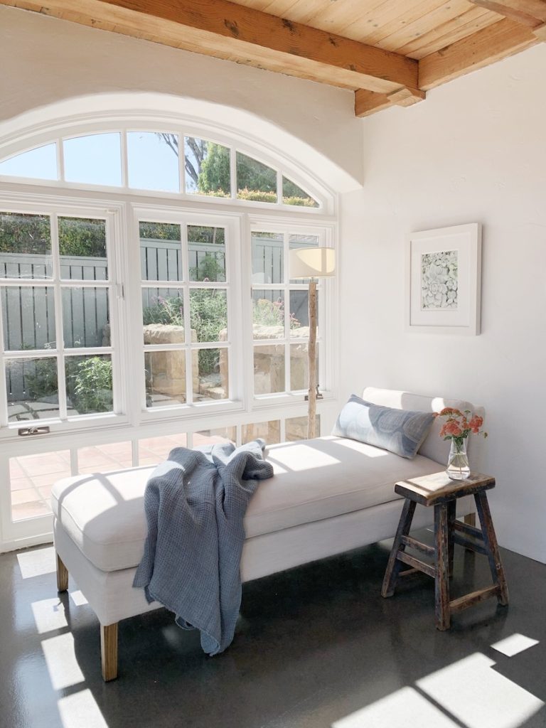
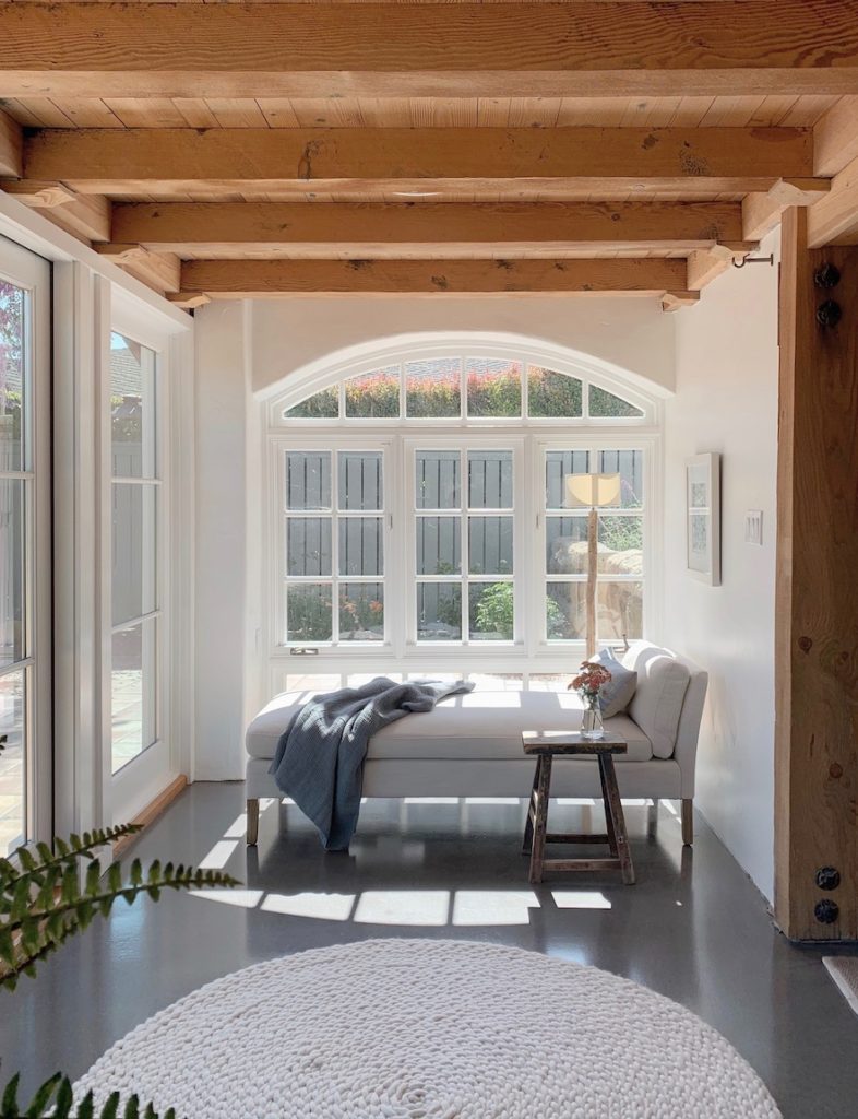
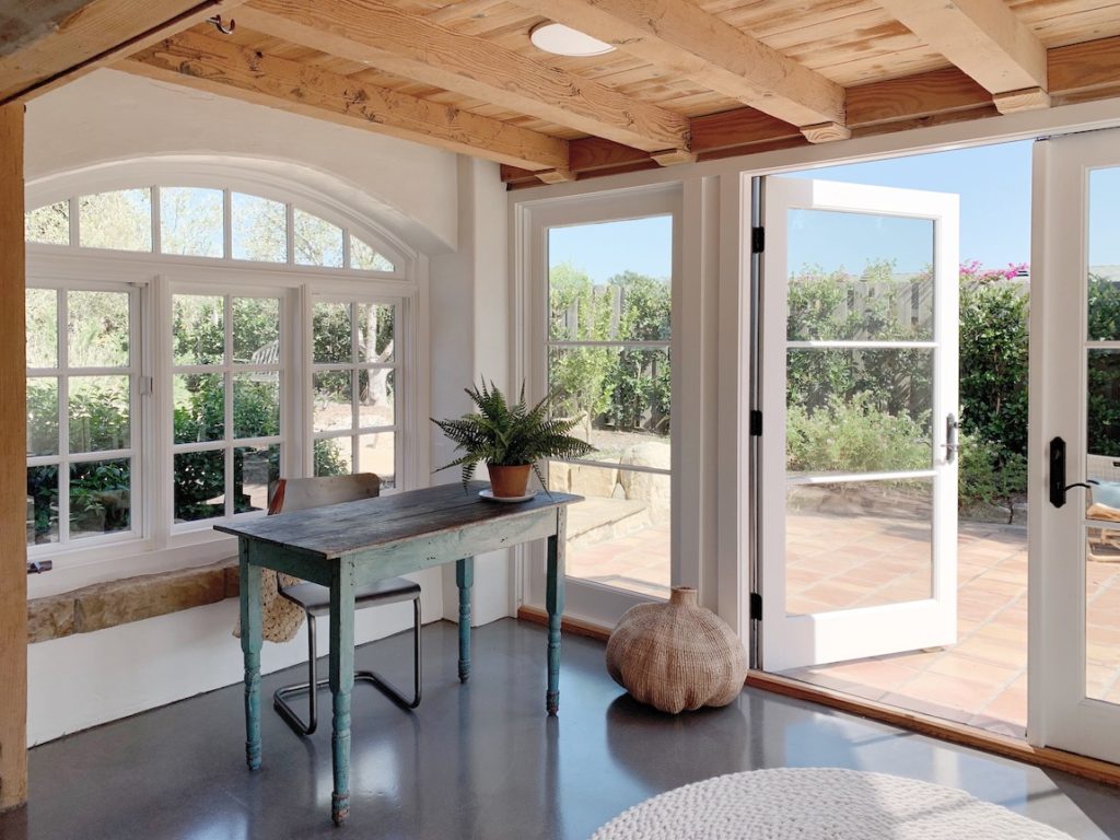
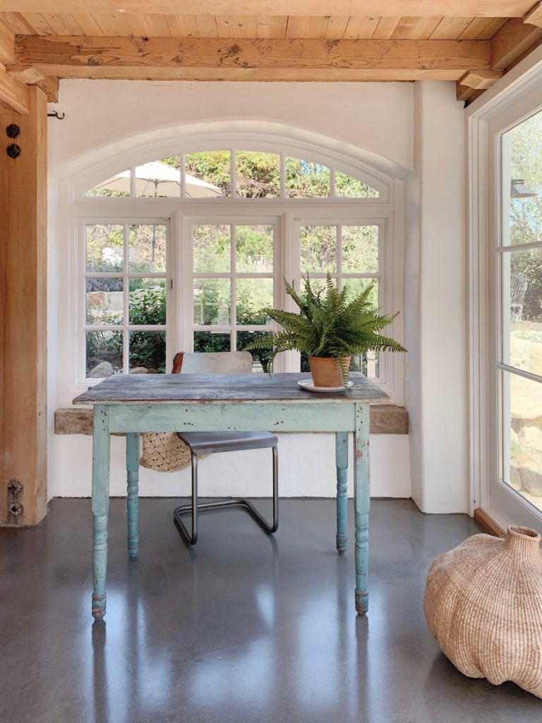
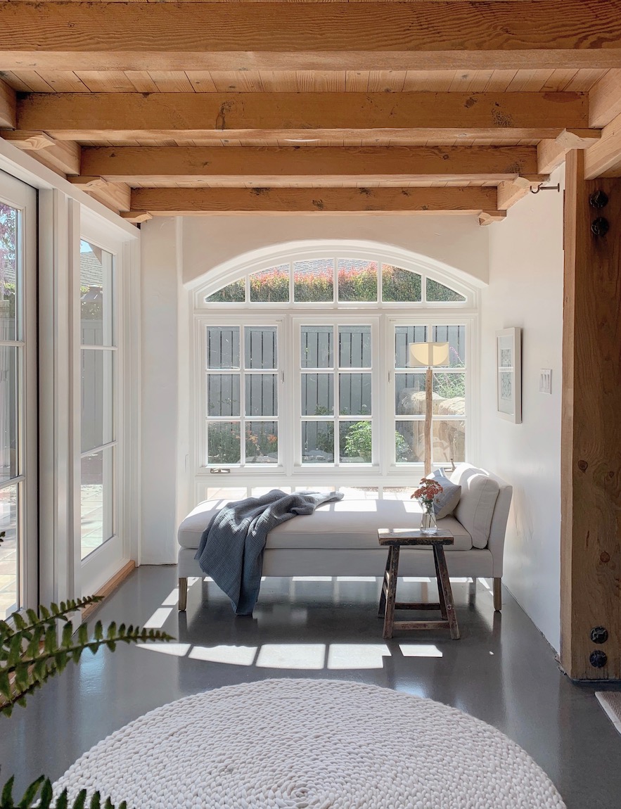
The sunporch has become one of my favorite spaces in this Spanish beauty. My client knew she wanted a small desk, but beyond that she left the rest up to me. This space is flooded with light from the French doors and multiple beautiful old windows. I thought it would make the perfect place to read a book or take a cat nap. The other side of the French doors would hold a simple desk and chair.
We started with the inside of the house, then turned our attention to the outdoors. The house was previously a yellowish cream color that made it look a bit dingy. We wanted to brighten it up, but with the intense Santa Barbara sun, didn’t want it to be a blinding white. After trying a few different whites, Benjamin Moore Simply White was the winner! The shutters were a custom mix.
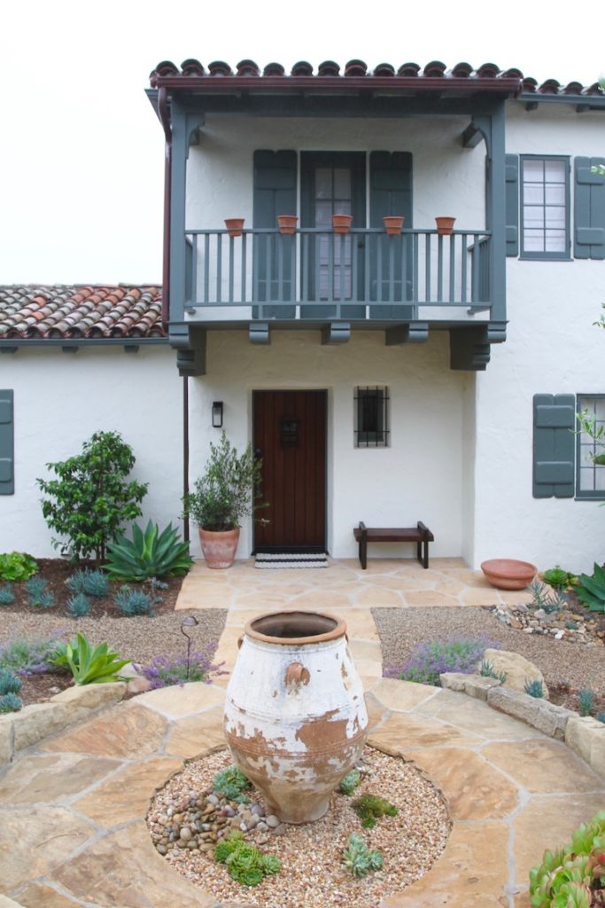
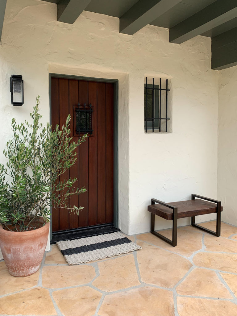
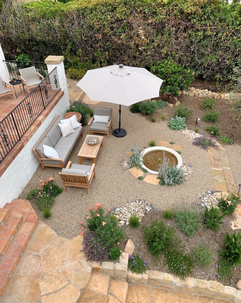
Grace Design Associates completely transformed the outdoor space. I would be remiss in not sharing this equally important renovation! The garden now has a wonderful “room” for a glass of wine at the end of the day next to a calming water feature.
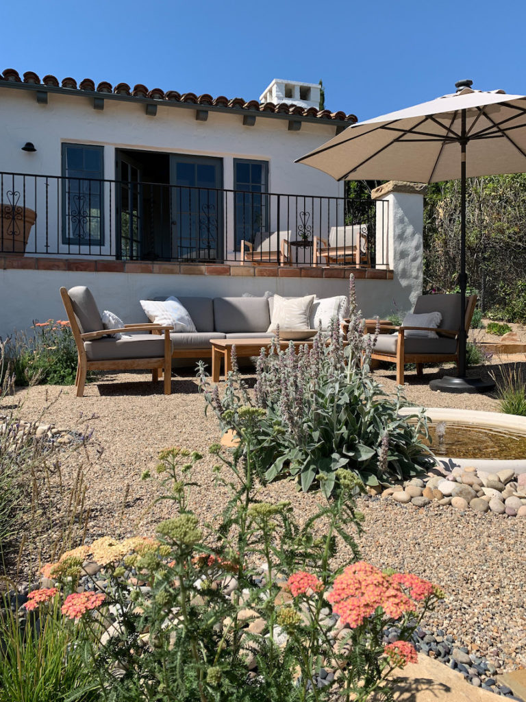
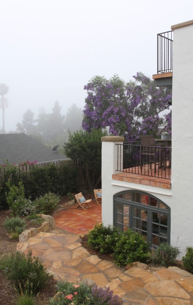
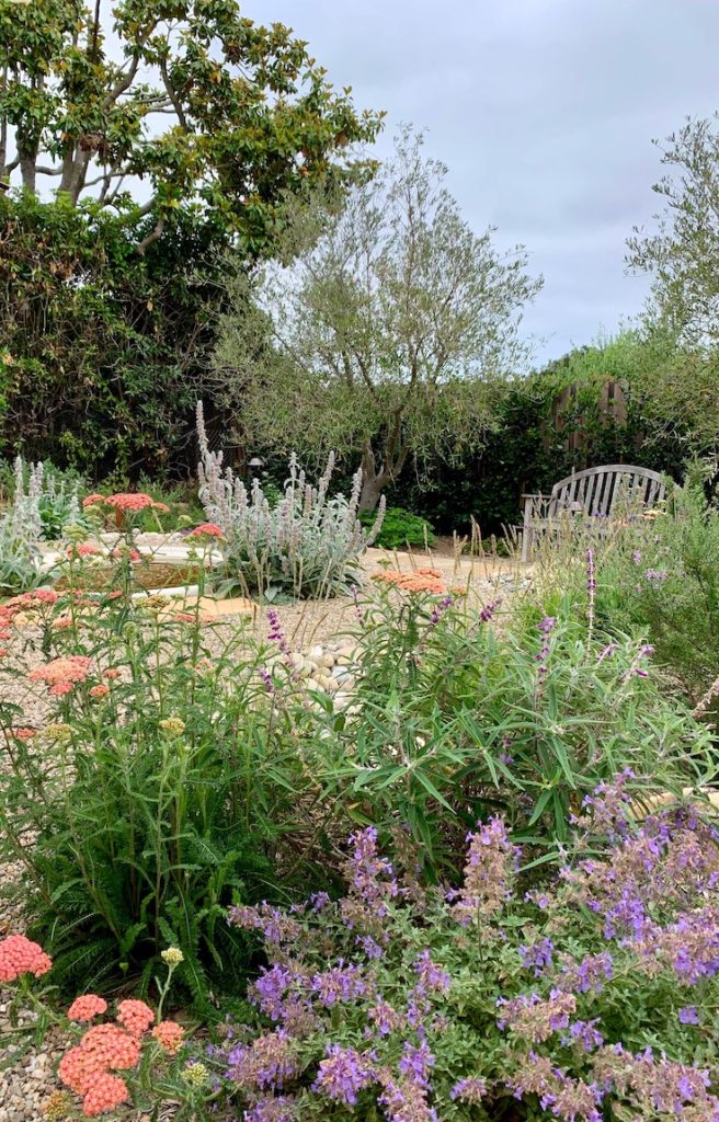
While there are still a few pieces and some art to be found, this Spanish beauty feels like home to my clients. And that to me is the best part of what I do.

What a gorgeous house and view! You’ve done such a nice job. Was the blue pillow on the bed custom made? Love it!
Hi Kim! Thank you. The blue pillow is a vintage grain sack I found antiquing in Vermont. It came like that. I just had to buy and insert and close it up! The color is so beautiful…I almost hated to part with it. 🙂
I can’t blame you for not wanting to part with it – it’s lovely. 🙂
At least I know it has a good home! 🙂