My most recent project began when I met my clients two years ago. They had recently purchased a 1932 Spanish style home in the historic Mission District in Santa Barbara. I’ll be honest…I was hesitant at first as this style of home seemed a bit outside of my wheelhouse. When I first saw the house, it was currently being used as a rental and had an eclectic traditional style. Additionally, it seemed dark even with the numerous windows and French doors.
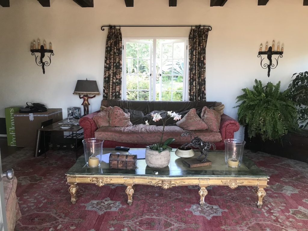
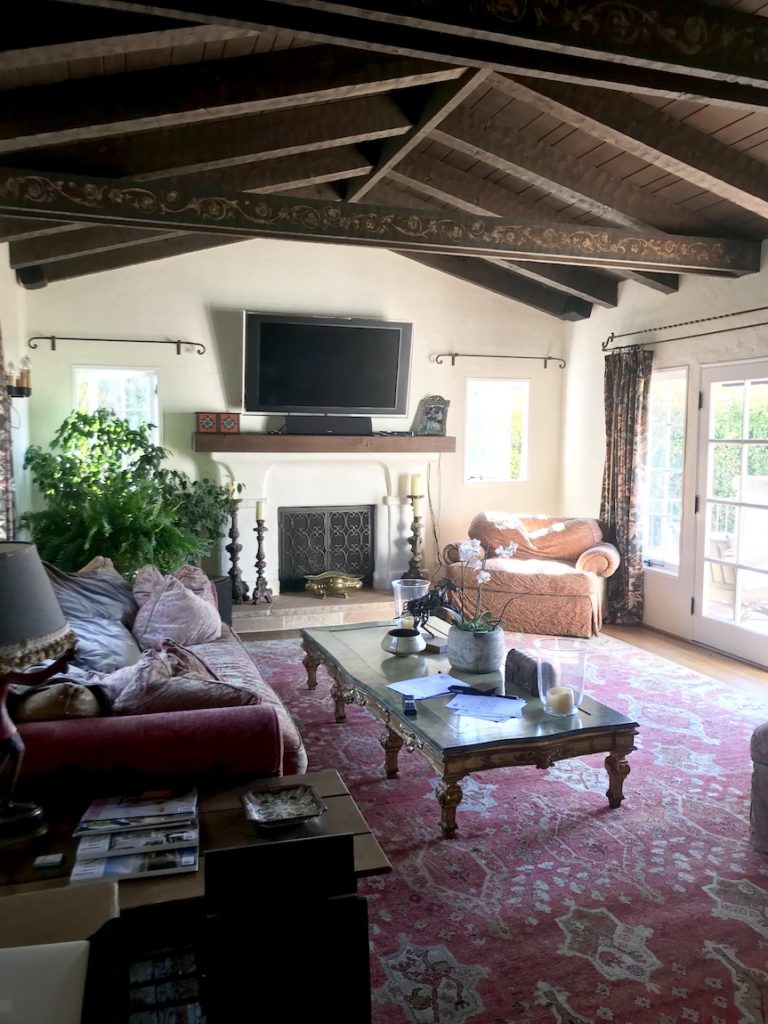
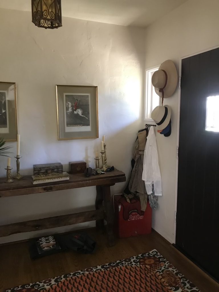
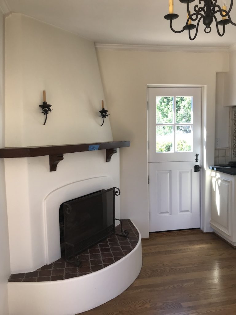
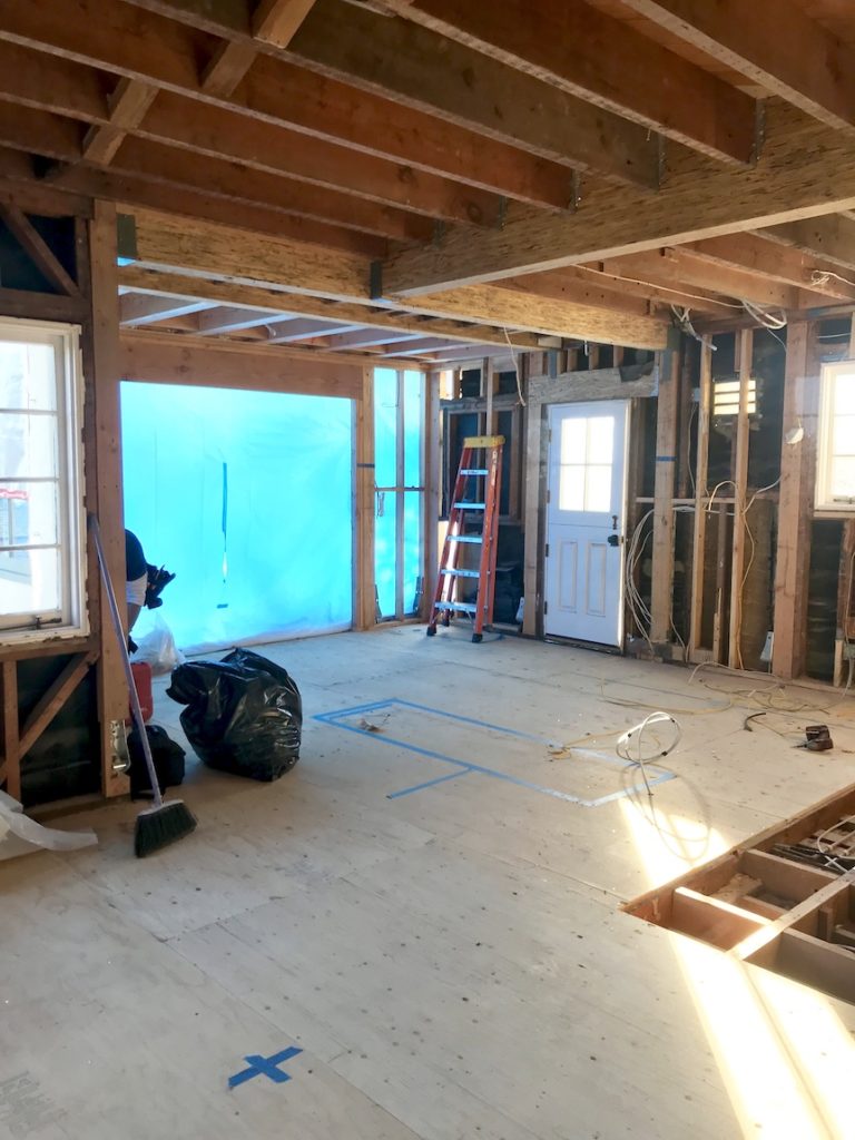
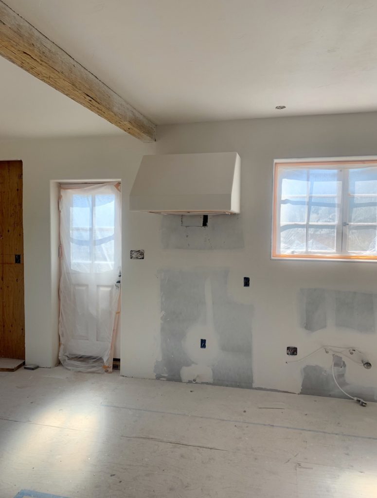
My first thought was how would my work translate to this beautiful but old world style space? My clients wanted something more modern and updated that would function for the way they lived. They had already hired the firm Projects to gut the kitchen and open it up to the small dining room. The kitchen had a lovely, but space eating corner fireplace that they wanted to replace with a pantry. Projects was also enlisted to enlarge the master bedroom balcony. One thing led to another and that required shoring up the house at the lower level. This became an arduous task requiring the demolition of all the saltillo tiles. As with any old homes, once you start doing digging behind walls and under floors, all sorts of other problems are likely to crop up!
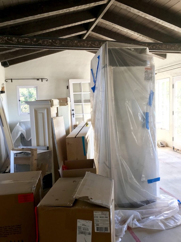
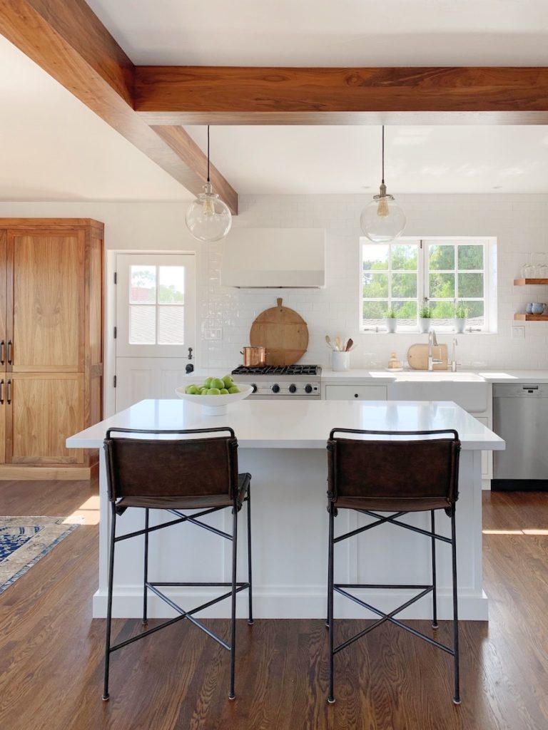
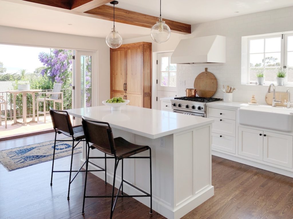
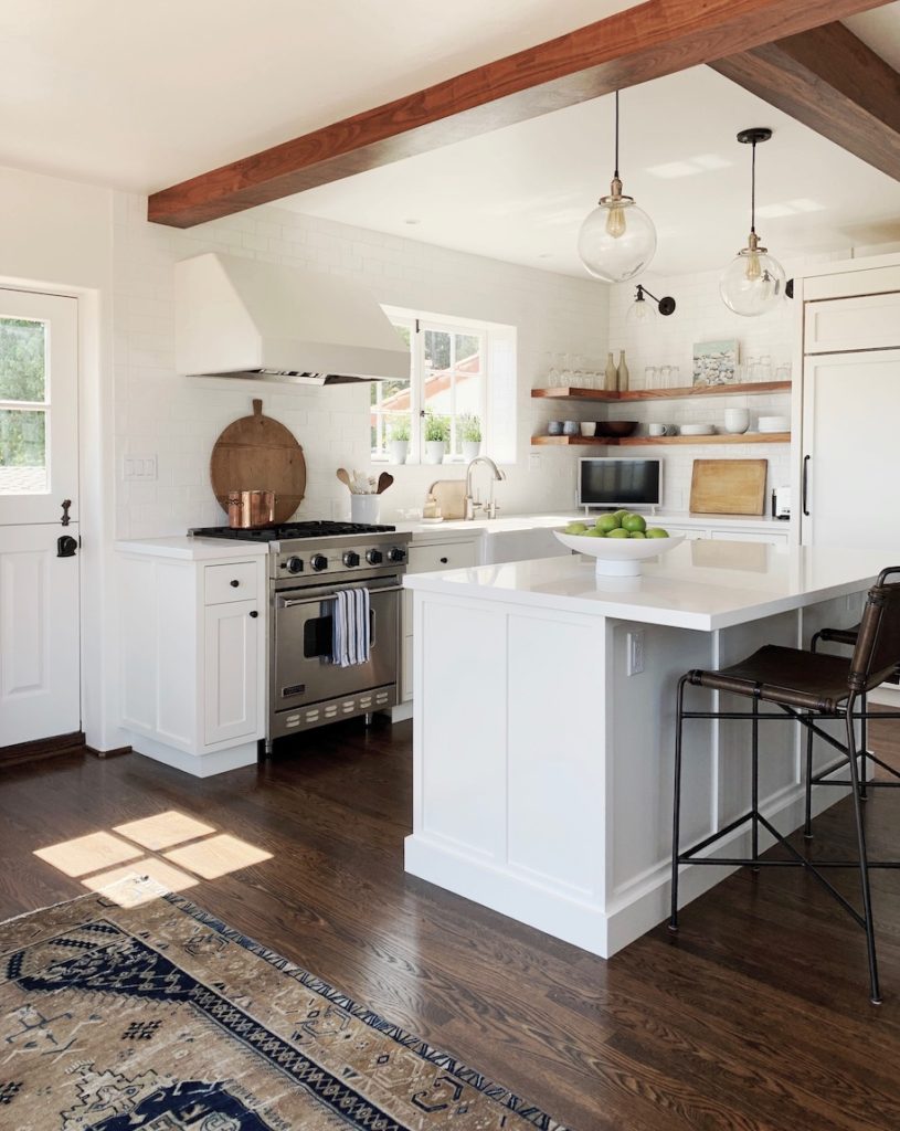
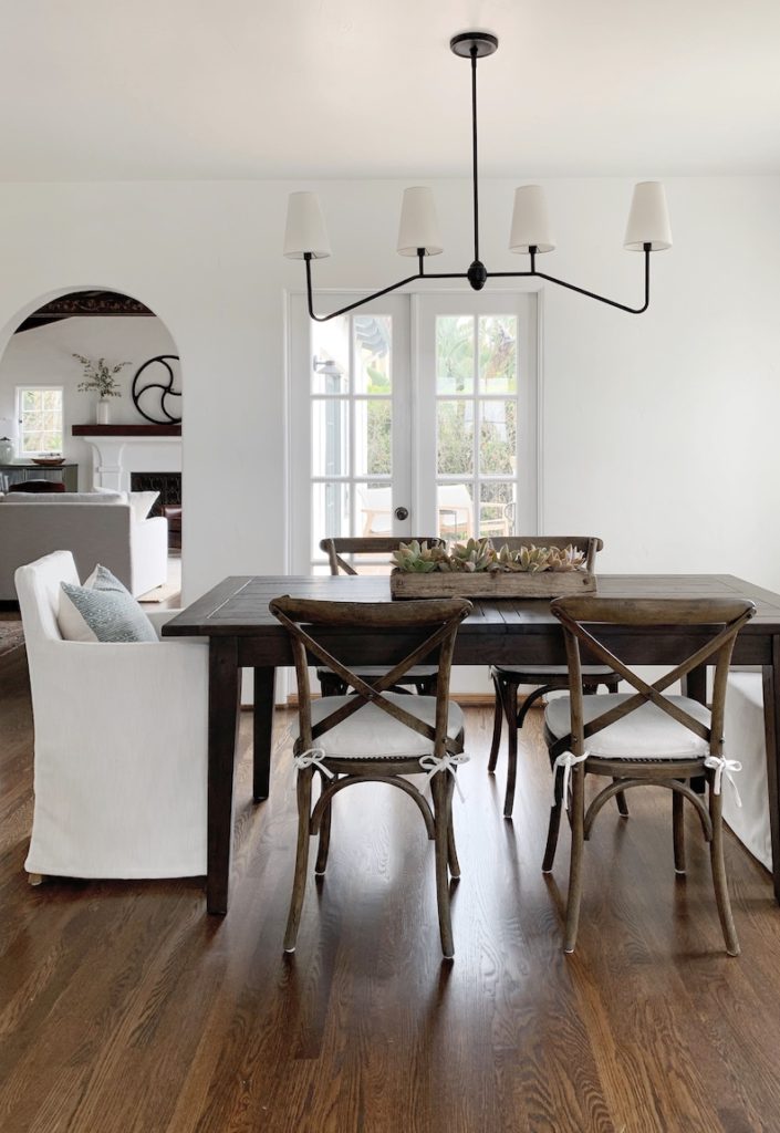
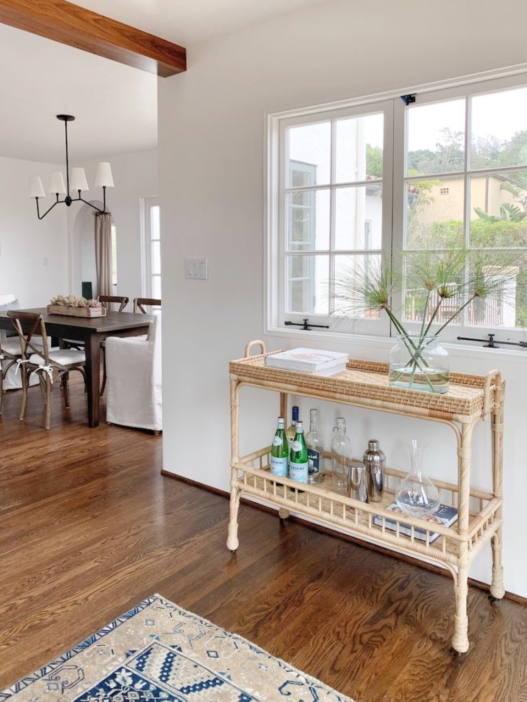
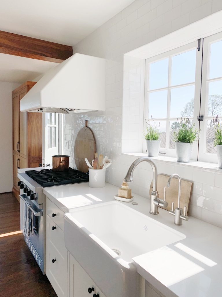
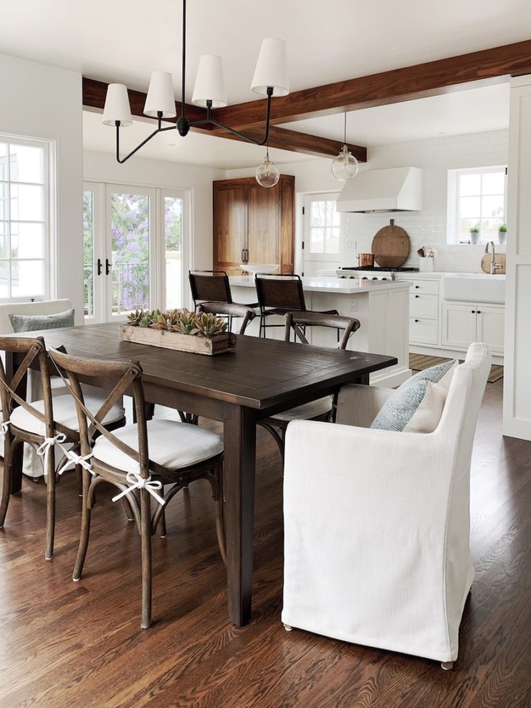
While the reno was progressing, I helped pick out the color to stain the newly refinished floors, countertop choices, and some lighting. The paint color throughout the walls and trim of the house is Benjamin Moore Simply White. My client wanted a white kitchen but was concerned it would be cold and perhaps too much of a contrast with all of the dark finishes in the rest of the house. I came up with the idea to do the pantry in a wood tone to match the floating shelves. It would add the warmth she craved and the structural beams were wrapped in walnut as well. It then became a waiting game until the renovations were completed.
In the meantime, we had just purchased The Big Sur House which kept me plenty busy! At last I got the call that things were wrapping up with the reno and it was my turn to help create a warm, comfortable home for my clients. I also had to remember that they would most likely be renting it out part time and that they expected to have lots of family and guests.
With this in mind I chose Perennials fabric for it’s durability, leather (which only gets better with age), and hard wearing indoor outdoor carpet for the media/family room and jute for the living room. A few vintage rugs add character and are practically indestructible.
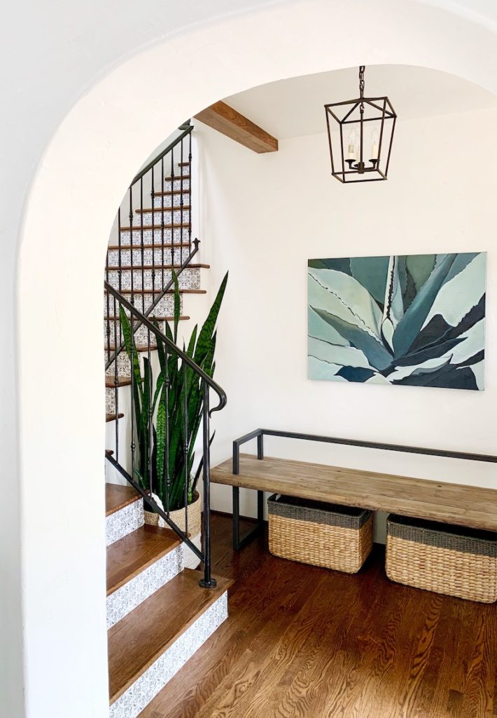
Opening the staircase in the entry hall opened it up to bring in more light and feel less closed off. I was on the hunt for a console, but my client wanted a bench with baskets underneath for shoe storage. At Viva Terra I found a simple wood and metal sculptural bench. I love that it brings a bit more modern aesthetic, but also has some rustic appeal. The baskets were Target finds. A plant to add an organic touch, and a gorgeous painting of an agave plant by Lety Garcia, are all this small entry needed. I’m still searching for just the right vintage rug to finish this space!
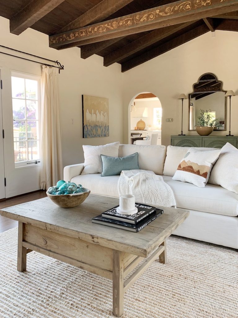
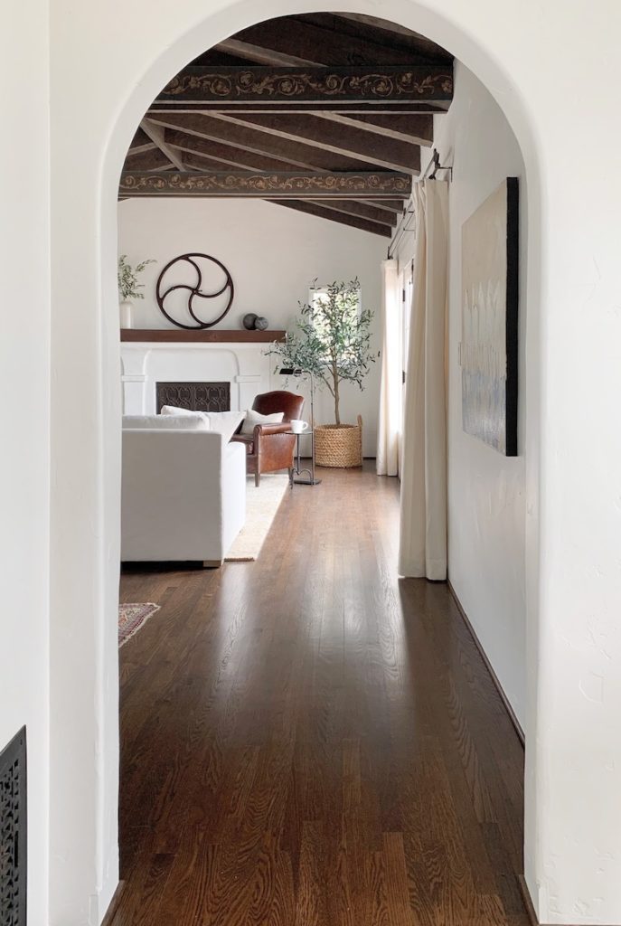
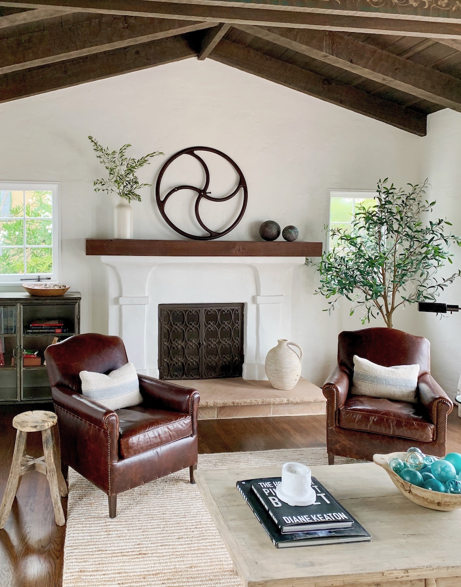
Just off the entry is the living room with its soaring beams and French doors opening to a terrace overlooking the garden. My client had originally toyed with the idea of painting the beams. I suggested that they would add soul and character to the room as is. She could always paint them someday if she so desired. Thank heavens they are still intact. They’re my favorite part of the room!
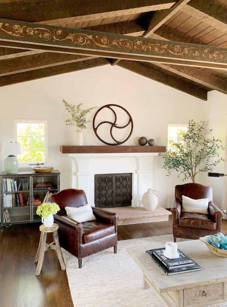
I wanted to balance the dark ceiling and floors with a light rug and coffee table. I like to mix the old with the new in the spaces I style. We waited forever for that coffee table from ClubCu (to the trade only)! It is one of a kind, has drawers for storage, and because of its light color, doesn’t take up too much visual real estate. I think it was worth the wait.
The metal bookcase is from Terrain (no longer available) and the vintage stool is from Porch. After trying multiple different art pieces over the mantel and none being the “one”, I came across this old iron wheel at Patine in Santa Cruz. I love the graphic simplicity of it against the white walls. Patine is chock full of gorgeous pillows, antiques, and linens. The small pillows on the leather chairs are from there as well. The textured jute rug is from McGee & Co.
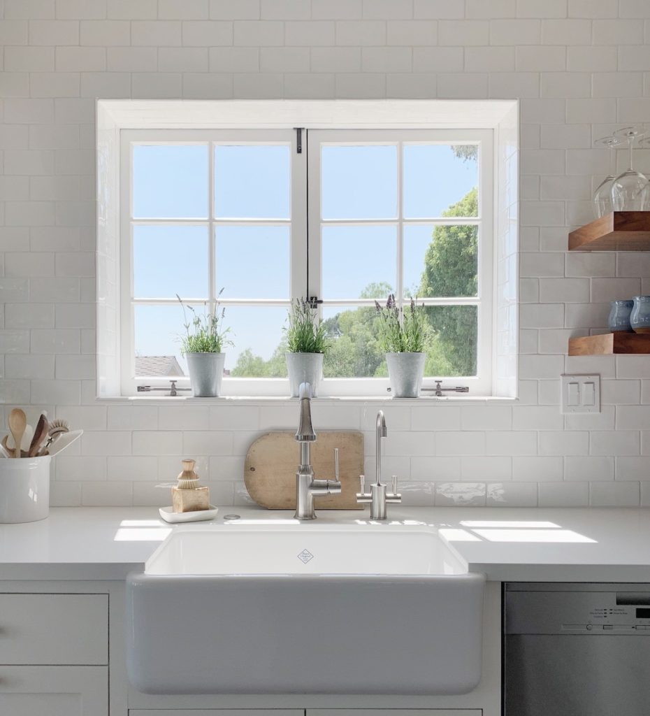
The original kitchen had an awkward layout with the refrigerator around the corner from the other appliances. A fireplace, though charming, took up quite a bit of space leaving very little storage. The Projects team opened up the wall between the kitchen and small dining room and by eliminating the fireplace, made room for a large pantry. We all decided to keep the dutch door instead of running a whole wall of cabinets. I love that little door! They also installed new large French doors opening to the terrace and an incredible view.
In my next post I’ll share the family room, my favorite reading nook, the master bedroom, and the outdoor garden renovation done by talented Santa Barbara landscape designer Margie Grace of Grace Design Associates. There was just too much good stuff to fit in one post 🙂 I hope you’ll join me next week for the rest of the tour!

So lovely! You have the eye and feel for what belongs. The owners must be ecstatic with the final result.
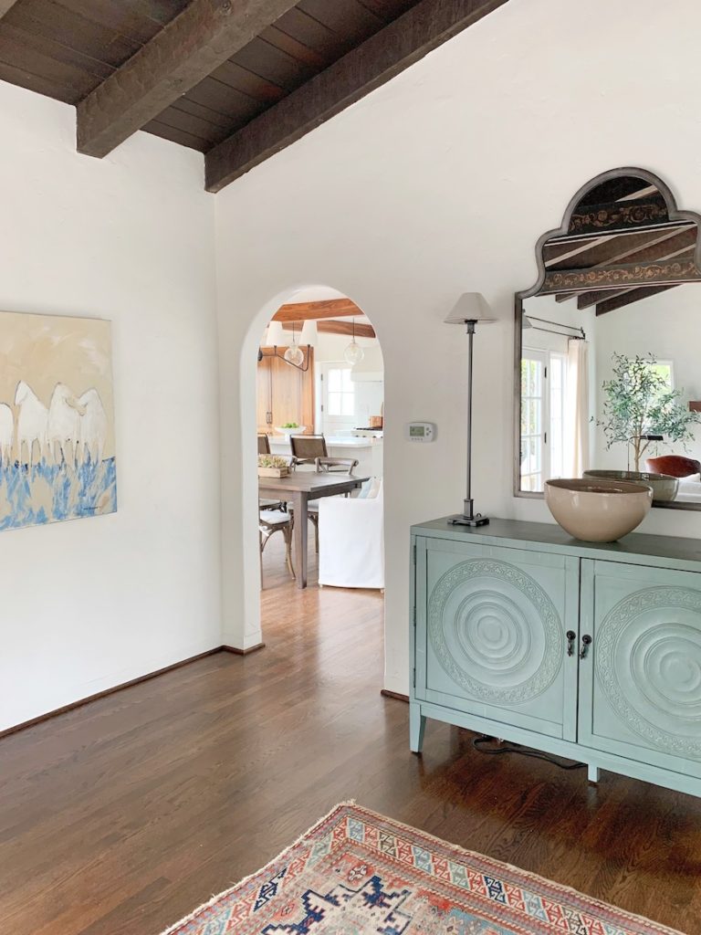
I’ve search high&low for the PB buffet.
Could you please share the name?
Thanks, Tracy
Hi Tracy. I just looked it up and it’s the Lorel Buffet Cabinet. It sadly says it’s no longer available. Boy they sure do change things quickly! I’m so sorry about that.
This renovation is gorgeous!!!
Thank you so much, Laura! I can’t take credit for the renovation although I worked closely with the team but as a collaboration I think we are all thrilled at the way it turned out. The clients are happy and that is always the most important thing! 🙂
[…] you read my post last week, I covered the entry hall, living room, dining room, and kitchen. We’ll continue the tour […]