In last week’s blog post I finished the tour of the downstairs of our beach bungalow. The upstairs consists of 3 bedrooms and a full bath. Although having just one bathroom isn’t ideal, there are usually only one or two of us there at any given time. And the bathroom had been nicely renovated with a skylight to bring in lots of natural light.
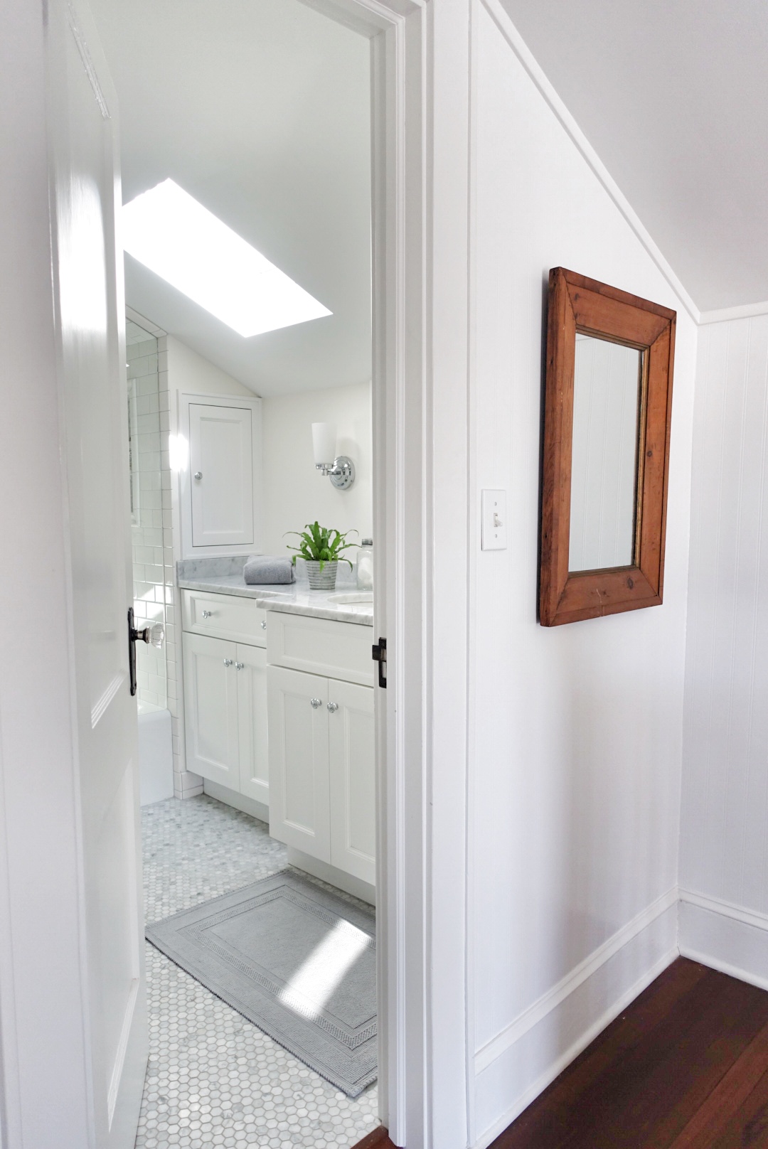
The upstairs bath freshly only needed paint, a rack for extra towels, and some accessories…
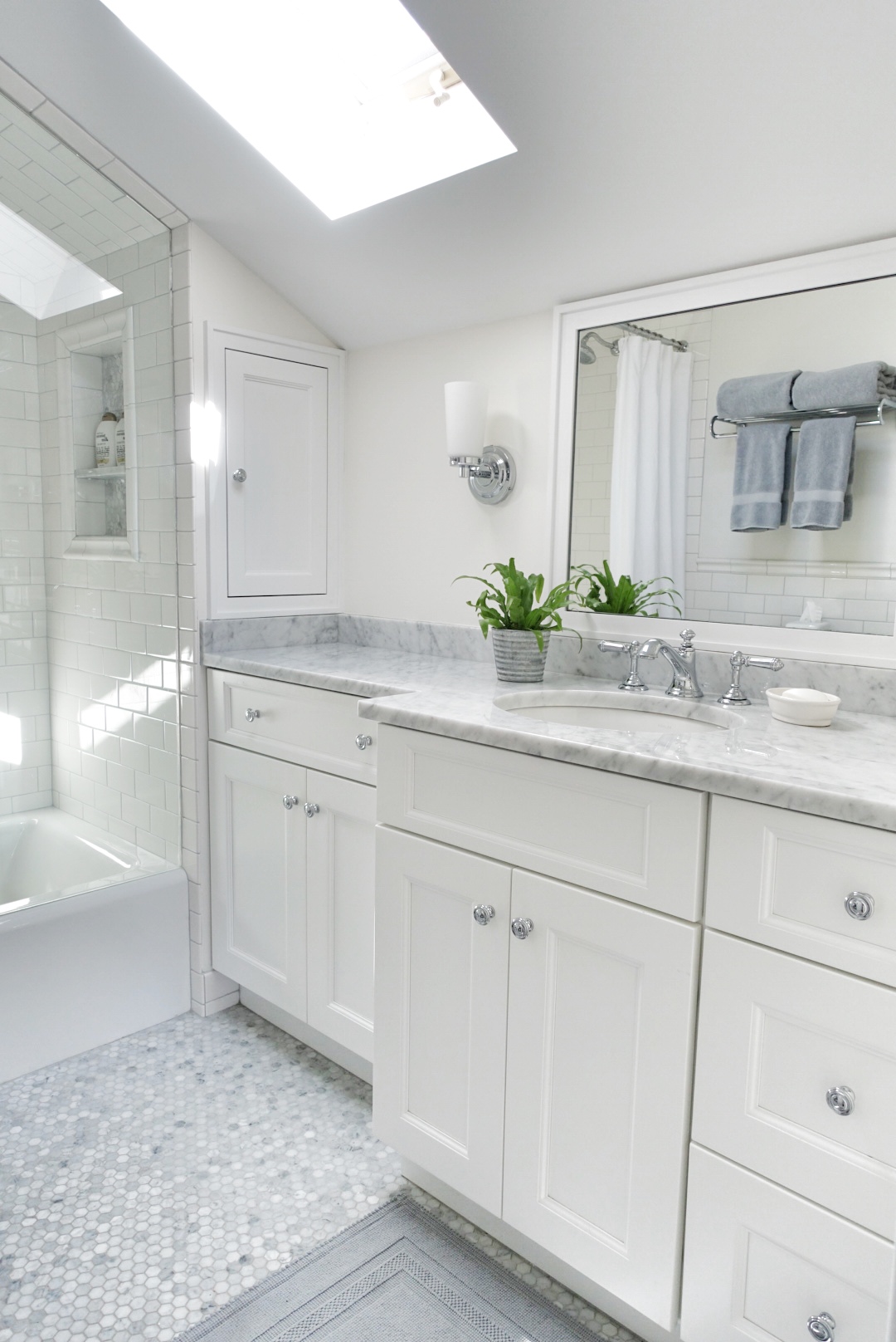
Love the natural light coming from the skylight…
A bit more problematic, was the layout of the master bedroom. While charming and pretty, it was a long narrow room (see floor plan at the bottom of this post) with closets at either end and a queen size bed. The way the door to the terrace opened, the bed needed to be pushed down near one end with the television stuck in an awkward corner next to the closet.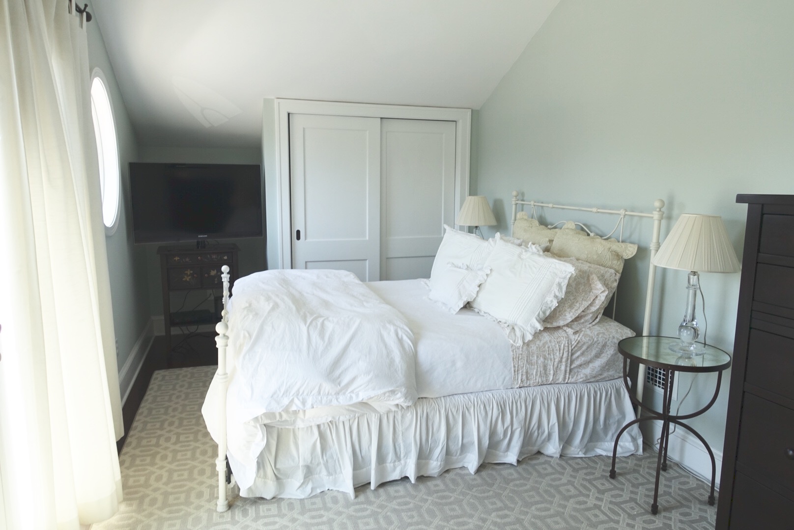
My husband and I both wanted a king size bed, and since this is his primary residence, he needed enough closet space for his many shirts and suits. We removed both of the closets at either end of the room.
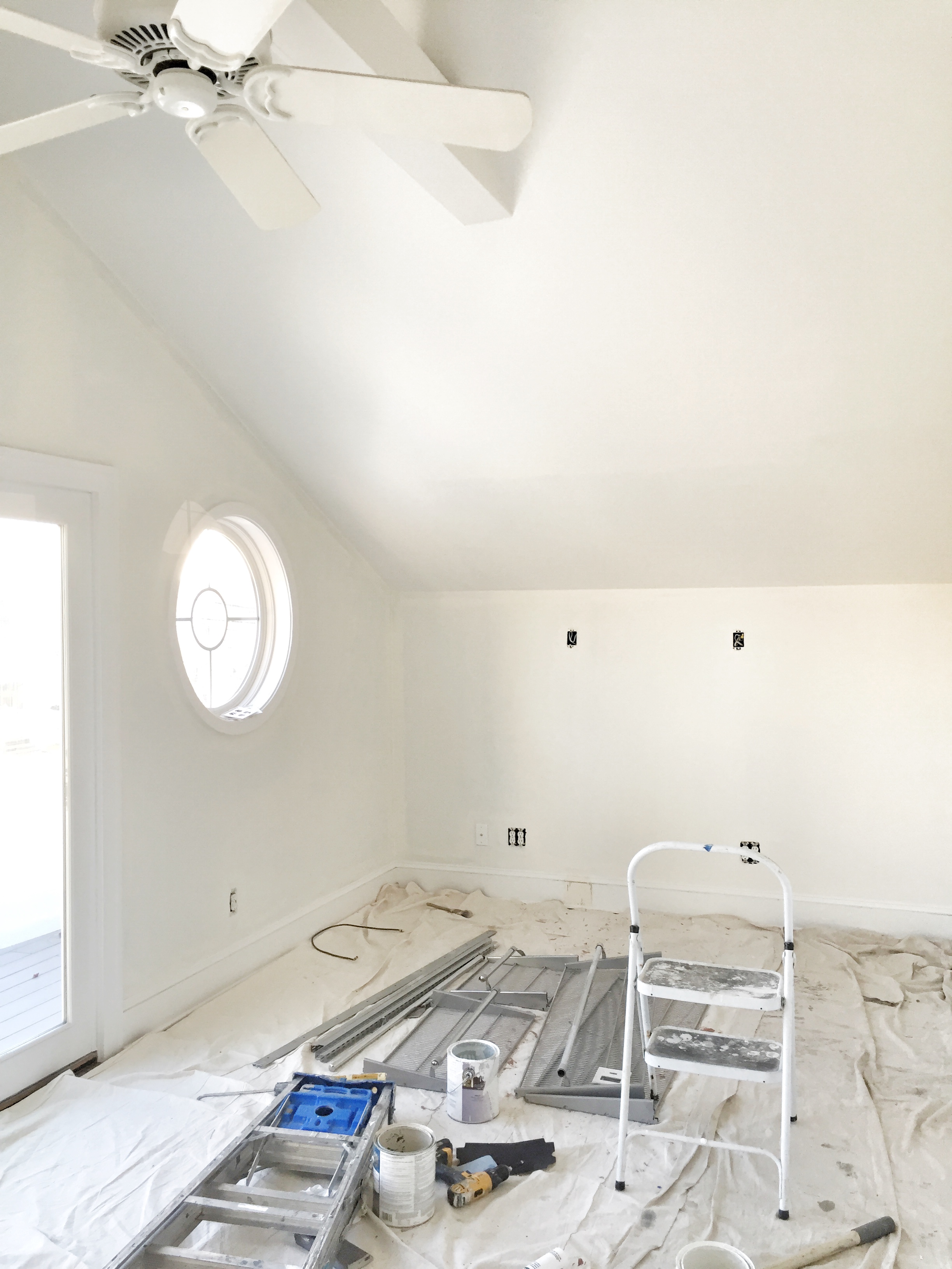
Removing the small closet at the far end, gave us room to put a king sized bed
My husband came up with the idea to build out the wall to create a walk in closet. No door is necessary as it is essentially a nook off of the master bedroom.
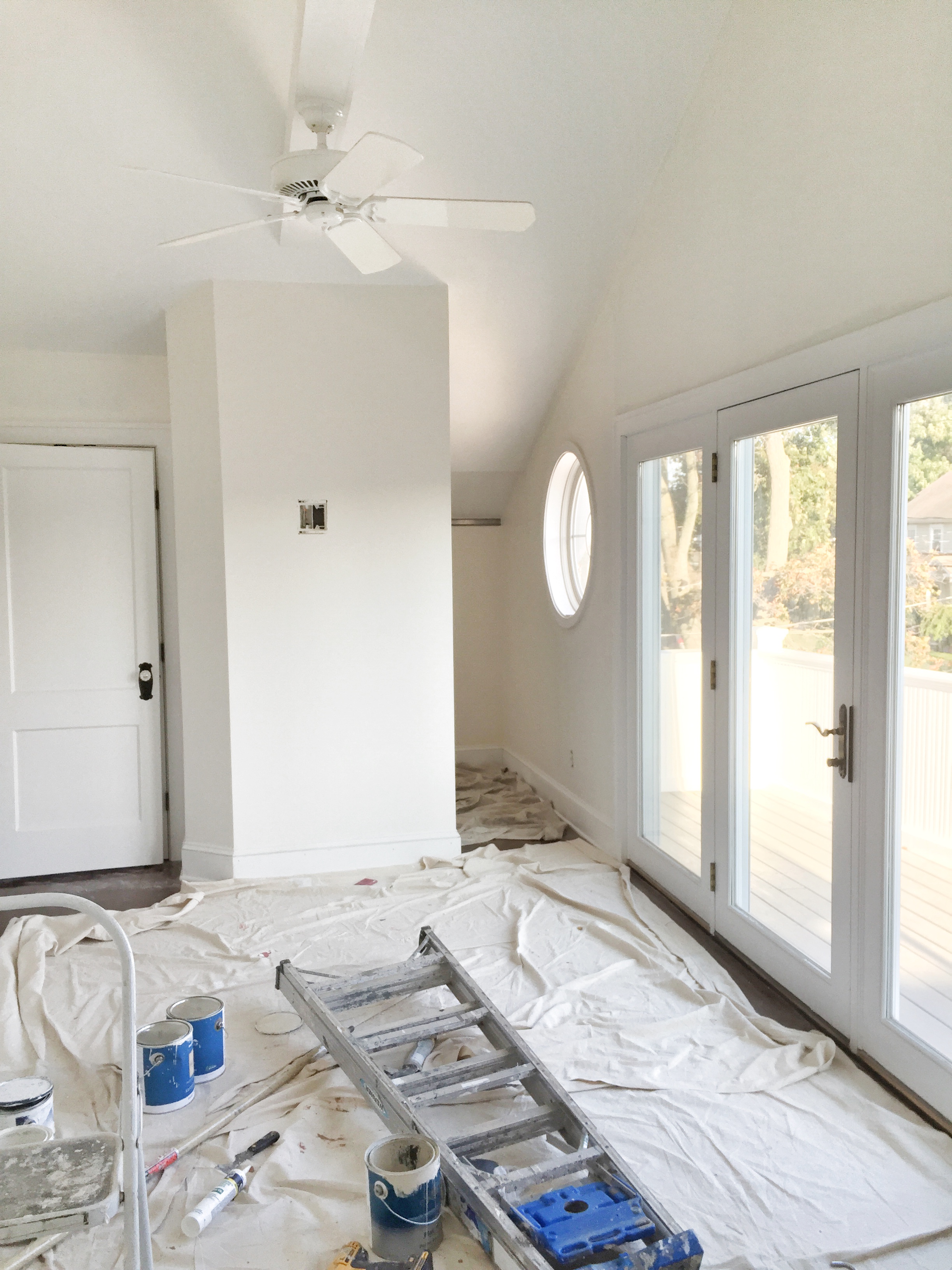
The new walk in closet…
This accomplished three things. The room didn’t seem as long and narrow, my husband had much more room for his suits, and we now had a wall to mount the television on.
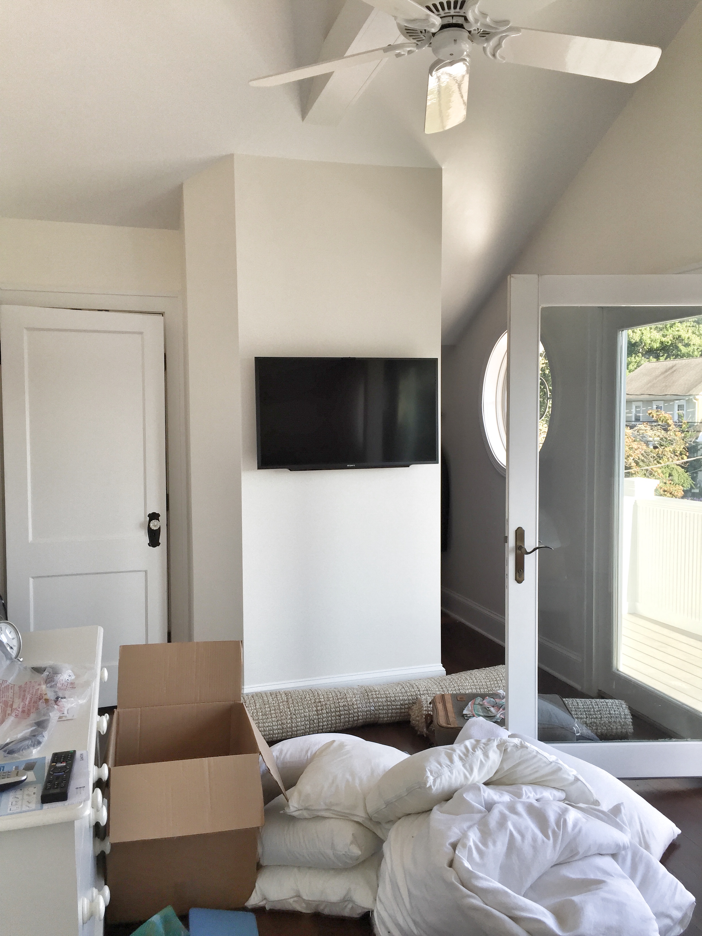
Moving day
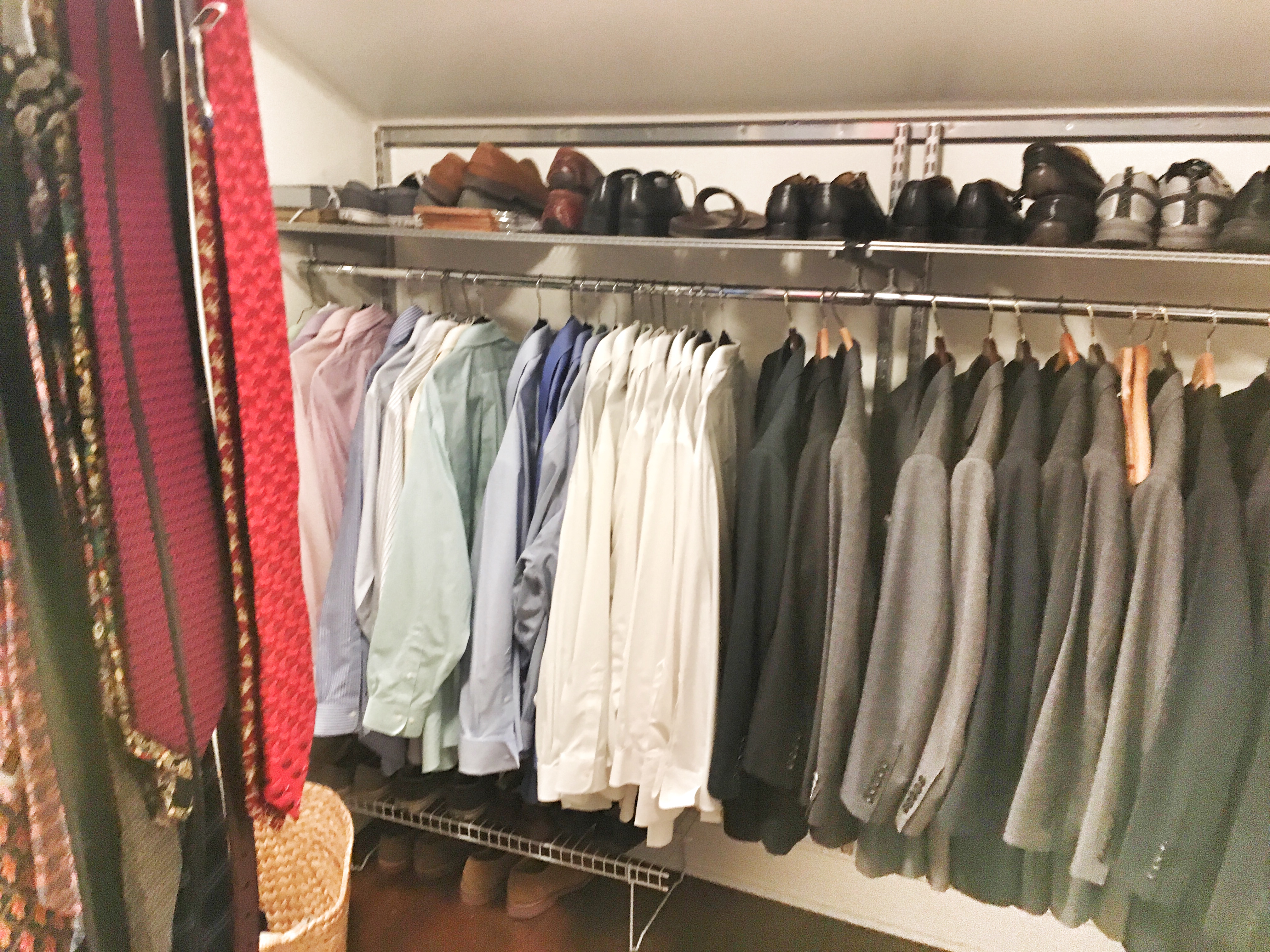
A peek at the new closet…
I purchased a simple modern bed from Room and Board to give it a casual coastal look. The duvet cover is from Restoration Hardware . We are in the process of having two floating end tables built that will continue the clean, airy, and dare I say “California vibe”.
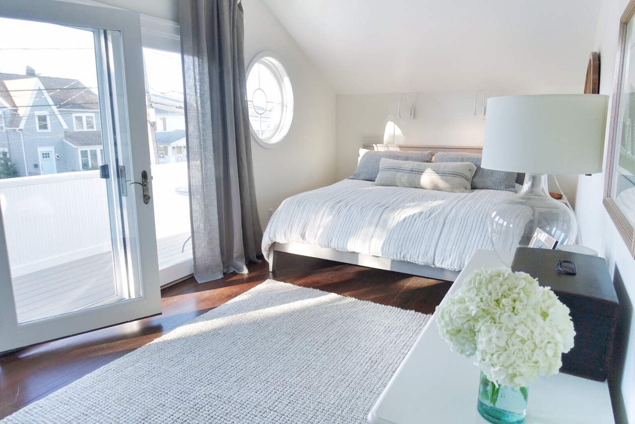
Our light bright coastal bedroom…
To keep it simple, I had two adjustable reading lights from Wayfair placed over the headboard. You would be surprised at how handy they are!
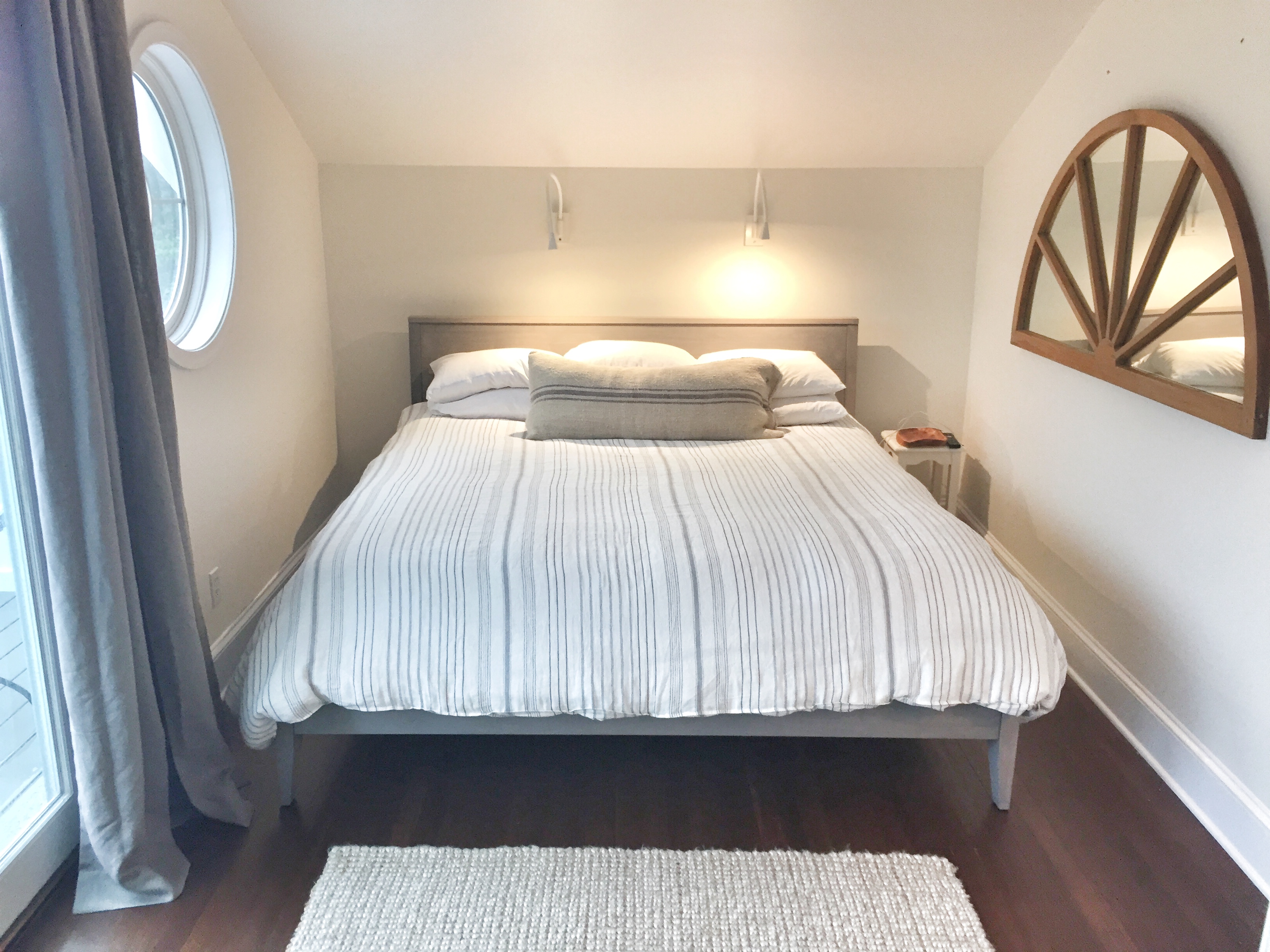
Swing arm wall lights deliver perfect light for reading…
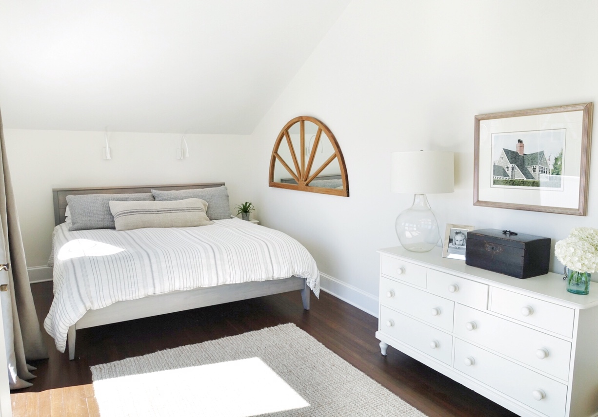
Pottery Barn dresser adds more storage
We were able to reuse our Pottery Barn wool rug and even our daughter’s old dresser, also from Pottery Barn. I may paint it one day but for now it works just fine. This is the brightest room in the house because it opens up to a terrace that I have yet to decorate!
The middle bedroom is being used as a place to play guitar (hubby, not me!) meditate, or just chill, so I kept it really simple with a chaise that we’ve had for years and an old desk that I feared we wouldn’t have a place for.
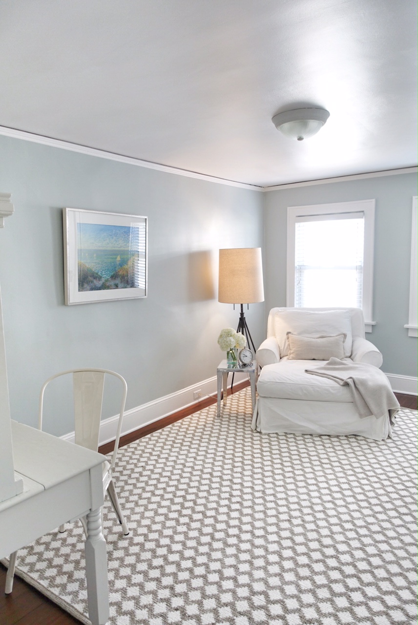
A comfy chaise to read, meditate or watch TV
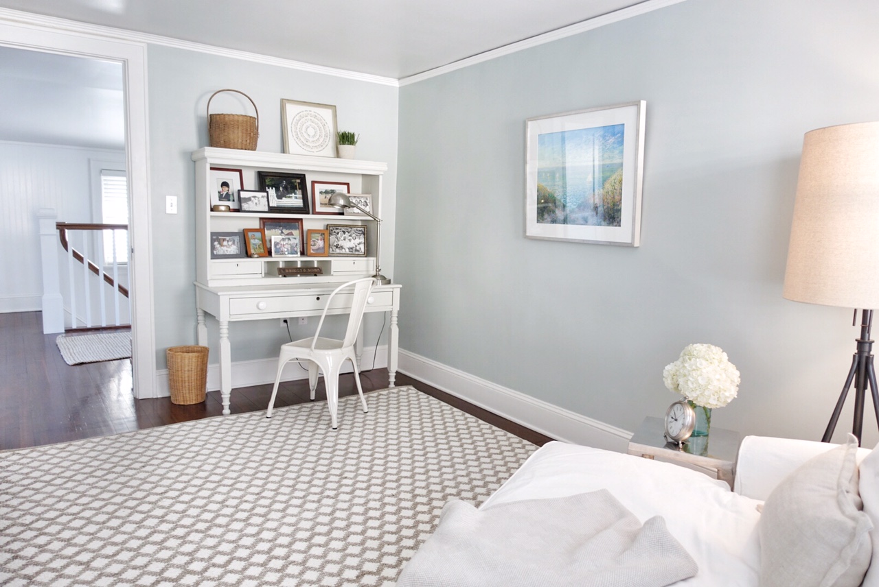
This desk has been in my family since I was small. A perfect place to display family photographs…
The cozy rug is from Pottery Barn.
The guest room is probably the least coastal style room in the house. I call it the “Equestrian Room”. Our daughter grew up with horses and competing from the age of six through high school. Needless to say, we’ve acquired quite a collection of horse stuff over the years and I thought it would be fun to have them all together in one place. Well, not all…that would require a much bigger room!
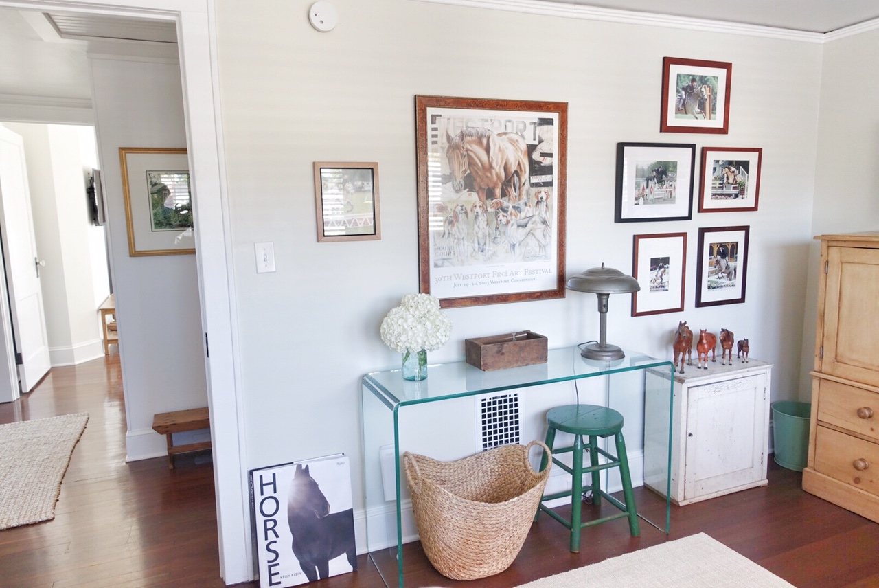
Pictures of our daughter’s horse show days in the “Equestrian Room”
The waterfall console was originally purchased for the entry but was too big. I got it on sale and really loved it and was happy to find that it fit perfectly in the guest room. the guest room. The little green stool was a find from Stone House Antique Center and can be used as a table beside the bed when guests stay. The bed has a trundle that pops up to create two twin beds without taking up too much space. We’ve had this bed for over 20 years. Lucky for us it comes apart or we would never have got it through the door!
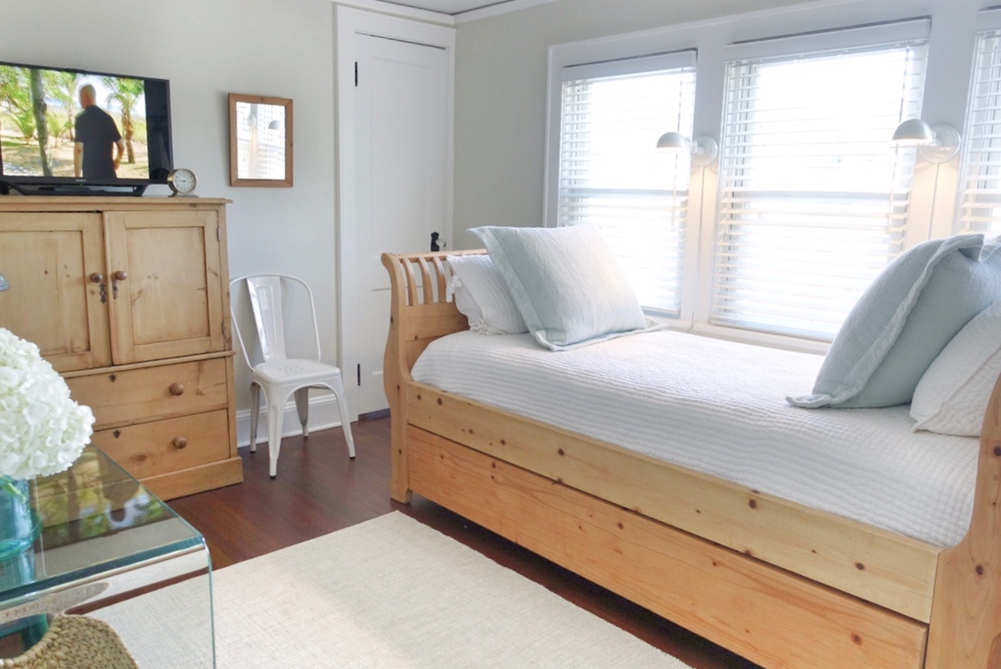
Our faithful trundle bed in its new home…
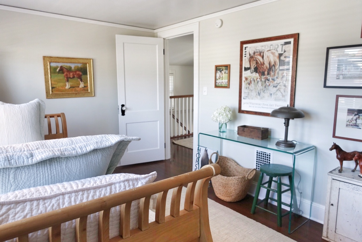
One of my favorite paintings on the far wall…
There is a nice size landing at the top of the stairs.
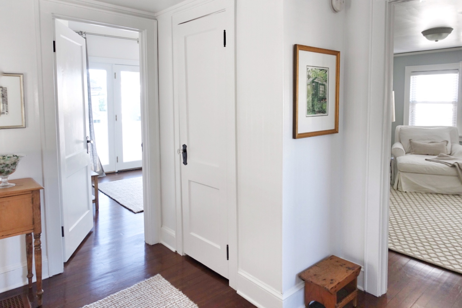
The landing…
Besides, her horse memorabilia, the one thing our daughter wanted us to keep was this funny little but tall night stand/cabinet. It was one of the last things to be placed but it’s perfect on the landing with a bowl of Connecticut sea glass collected over many summers…
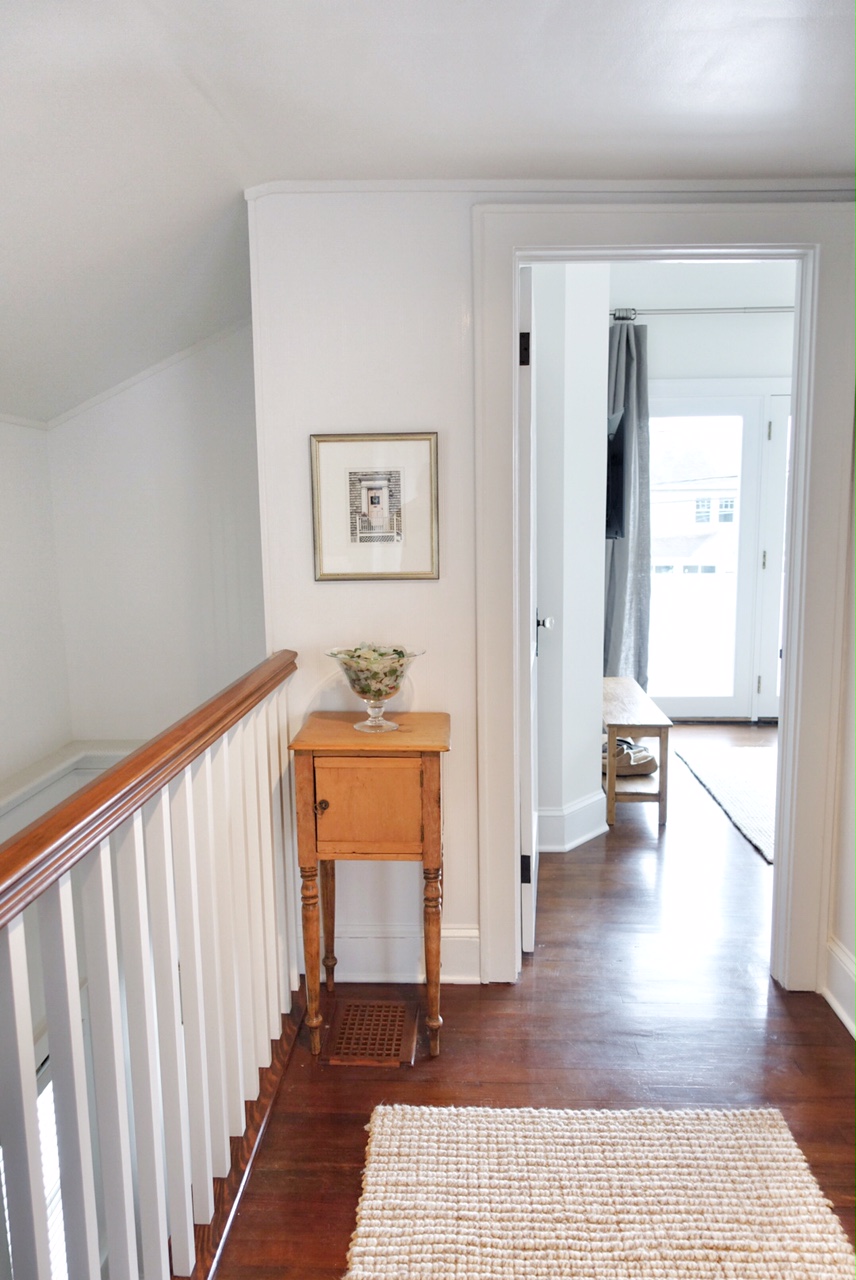
Our daughter’s little night stand found a home on the landing
And thus ends our tour of our Little White Beach Bungalow. Of course there will be tweaking going on and there is much to do outdoors, but that will have to wait until spring…
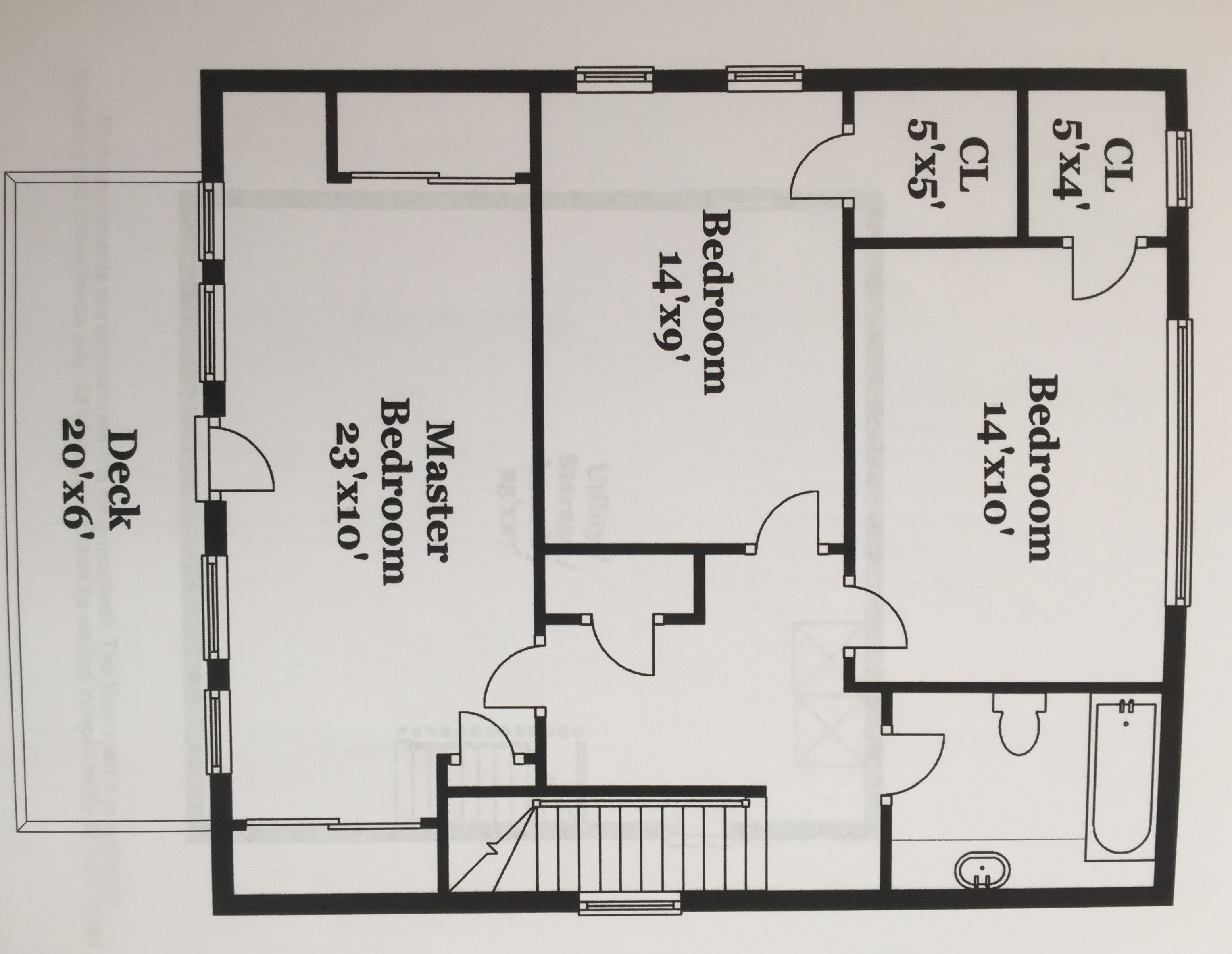
Before the Master Bedroom reno

Elizabeth, you really don’t disappoint, I love what you’ve done, the main bedroom in particular looks so much better. Need your touch in my home.
Thank you, Pinder. There are still other touches that I would like to do but with such a small time frame, this will have to do. It’s a really cozy little house and I look forward to returning at the end of this month!
What is the color of the paint in the middle bedroom? Is it a blue or a grey? I really like it!
Hi Kathy. It’s Benjamin Moore Quiet Moments… a really pretty blue gray. Even my husband who is not a fan of blue, loves it! 😉
What a difference that master bedroom makes! Great vision.
Thank you! We love it.
I love what you did with the place, Elizabeth! The master bedroom in particular looks so beautiful and serene. Moving the bed to the back wall totally changed the room. Can’t wait to see your vision for the balcony 🙂
Thanks so much, Eva. It was a group effort between my parents, myself, and my husband. In this case 4 heads were better than one! I’m excited to work on the outside porch, terrace, and yard but most of that will have to wait until spring 😉
Who was the house architect? The the bones as well as the interior design!
Hi Julie. The house was built in the 1920’s and I’m not sure who built it or did the renovations. The interior design was done by me. I hope that answered your question. Have a great day!